PowerQuest has its own gui system, it's a simpler system than Unity's and designed to have a similar workflow to PowerQuest's "Rooms".
That said you can totally just use Unity's Gui if you're already familiar with it. (Just add a GuiComponent to your guis so that PowerQuest knows to ignore clicks on it.)
The main PowerQuest window has a list of Guis. This is automatically generated from any Prefabs in your project that have the GuiComponent component.
From here you can:
Click an item in the list to jump to it in the Project window
Click Edit to open the Gui prefab for editing.
Click Script to open the Gui's quest script. (See GuiScripts)
Click ... for other options, such as removing, renaming.
Click the + button to add a new Gui.
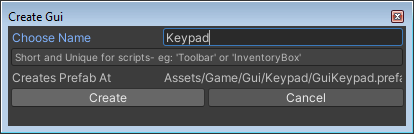
Just like creating a new room, this creates a bunch of files. A new folder with your gui's name will be created under the Game\Gui\ folder.
Files include: Prefab, sprite importer, atlas, and script. A shortcut to the gui is also added in the game code, so your gui can be accessed like so: G.YourGuiName.Show();
After clicking create, wait for Unity to compile the scripts.
Gui Editor
Click Edit to open a gui prefab for editing.
Alternatively, to edit the gui in context, drag the gui prefab from the project window into the scene, then double click it to edit.
This means you can see the scene around it. Pretty helpful, especially if aligning it to edges of the screen.
When a gui prefab is being edited, the PowerQuest window switches to a gui editing tab.
Select selectes the gui itself so you can adjust its settings in the inspector
Edit... well, you're already doing that. I should remove this option ;)
Script opens the script
Add Gui control, or the + button adds controls (our name for gui elements) to the Gui.
eg: Labels, Buttons, etc
See Controls section for more info
Selecting the Gui itself opens the inspector
Gui Settings
Data. Unfold this to get to the meat of the Gui settings
Properties under the 'Data' dropdown can be edited from scripts, (eg: G.Keypad.Visible = true;) are included in the powerquest save system.
Most properties are self explanetory, or you can HOVER over them with your mouse to get a tooltip.
Baseline: Guis are sorted the same as props/characters.
This means a LOWER baseline is IN-FRONT.
The baseline can also be dragged around in the scene view.
Visible Whether the gui starts visible.
Visible In Cutscene: whether the gui is hidden whenver a blocking game script is playing out.
Modal: Modal means that the gui doesn't let any clicks through below it. Best for pop-ups that the user has to dismiss before doing anything else.
Note that you'll still be able to click items with a lower baseline (in front of it.)
Show a gui with ShowAtFront() function to turn on guis if you want them to always be on top
Hide Obscured Guis: Any guis behind htis one (with higher baseline) will be Hidden.
Hide Specfic Guis: A list of guis by name that are Hidden when this gui is Visible.
Animations/Sprites: Read only lists of sprites and animations that controls can use by name.
Script Functions: Click these buttons to add/edit the corresponding script.
Button (Text): A button that resizes to fit the text inside it
Button (Empty): A button with no text, also has no image assigned yet.
Label: A bit of text.
Slider: A draggable horizontal slider
TextField: A field used for text input form a keyboard
Inventory Panel: A scrollable grid of inventory items.
Control Settings
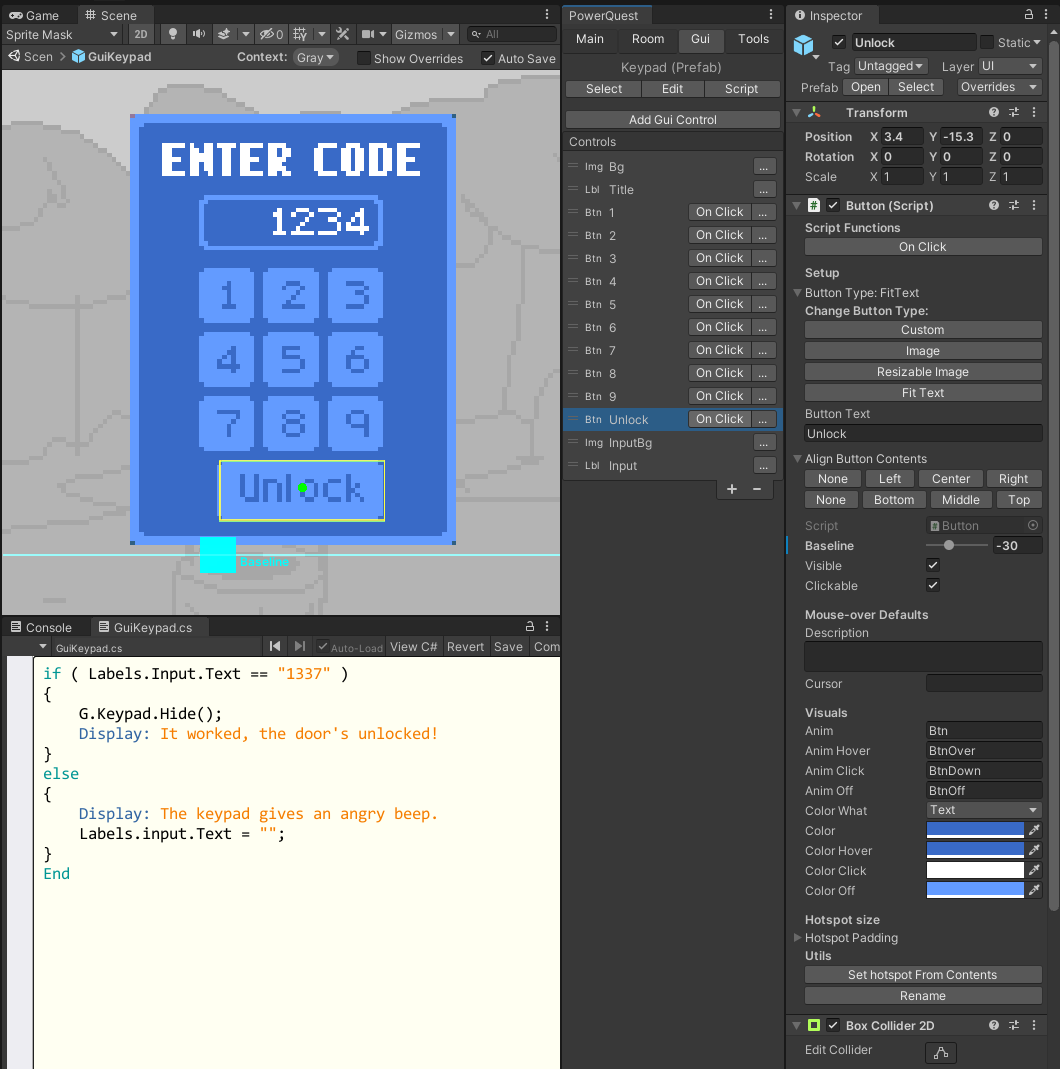
Here's an example editing a "Keypad" gui. The "Unlock" button is selected, you can see it's data in the inspector, and it's "on click" script open too.
Controls all have different data in the inspector. Hover your mouse over items for information on what isn't documented here:
Name: Rename the control's gameobject at the top of the inspector. This name is used in scripts.
Position:
Change the position of the object the regular unity way.
If using layout components, position may be set automatically. (see Layout section below)
The green dot in the scene view is the "pivot" of the gui control.
Baseline: Controls the sort order.
Like guis and props, etc, LOWER is IN-FRONT.
Can be set in the scene with the cyan line/dot.
Advanced: If you need to sort multiple child objects of a single custom control, set them the z depth.
Size: Images, Inventory, and some Buttons can have their size set.
You can also drag out the yellow square in the scene view. It's snapped to
Button Type:
Custom: You'll need to set the hotspot size yourself.
Image: Hotspot is automatically taken from the image. Use this for buttons that work basically the same as a Room's Props.
Resizable Image: Button is set to use a sliced sprite that can be resized. Hotspot is set automatically
Fit Text: The button is assumed to have Text, and the hotspot and image are scaled to fit the text
Button text: Shortcut to setting the text in the child Text object.
Align Contents: Aligns child images/text of the control
These buttons will align the contents of the control around the pivot.
They're kind of reversed to how you'd expect. Since it's aligning the content to the game object's pivot.
The pivot is shown as a green dot in the scene
Eg. Right Align will right-align text, so that it's right side is at the pivot point. Image's right side would also be at the pivot point (so to the left of the pivot... confusing I know)
Visible/Clickable: Self explanetory
Anim: The sprite or animation of the Image or Button
PowerQuest will use animations or sprites in the gui's Sprite folder. If not found, try in the Gui/GuiSprites/ folder, and the Inventory/Sprites folder.
If an animation is found that will be played, otherwise it'll check for a sprite to set.
Anim Hover/Click/Off: Anims/sprites for when a button: has cursor hovered over / is clicked / is set to non-clickable respectively. Leave empty to ignore
Color Hover/Click/Off: Simlar to button anim's but it sets the Text color, or the image color (depending on "Color What" setting)
Hotspot Padding: Buttons can set padding around their hotspot when it's automatically set by the image or text.
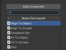
Layout
There's a few components to help with gui layout. These can be added to any gameobject really, but are intended for Gui Controls.
Align To Object
Aligns the gameobject pivot to another gameobject.
Drag the object you want to align to into the Object field.
Use the Vertical/Horizontal dropdown to set which side to align to.
You can also offset a number of pixels, or a ratio of the object's size.(eg: 0.25 would be a quarter of its size)
Align To Screen
Aligns the gameobject to an edge of the screen. Similar to Align To Object.
Fit to Object
Used for making an image that stretches to fit other objects inside it.
Adjusts the size/scale of the gameobject to fit specfied object(s) inside it.
The gameobject should have a sprite, or a child object that's a sprite. Usually you'd use a sliced sprite for this purpose.
Drag objects into the Fit Width and/or Fit Height fields.
Padding sets extra space around the object.
Snap To Pixel controls whether to snap bounds to pixel.
Include Children controls whether to look for renderers in the children of the objects or not.
Fit to Screen
Same as Fit to Object, but stretches to fill the screen (either vertically or horizontally)
Dropdown Bar
Useful for gui bars you want to appear when your mouse moves to an edge of the screen.
See "InventoryBar" gui for an example.
The curves are a bit fiddly to set up from scratch, you can copy the curves from an existing inventory bar.
Grid
Aligns specified objects in a grid.
These can be added/removed at run time by script too.
Used by inventory panels if you need an example to look at.
Item Spacing gives the units between each item in the grid.
Setting the Size (or dragging corners of the yellow box in the inspector) will automatically set the number of columns per row, Scroll columns and/or scrolls rows, based on the item spacing.
Columns per row is how many columns of items are shown horizontally before wrapping to the next row.
Scroll Columns is how many columns of items are shown before cutting items off. (And needing to scroll horizontally)
Scroll Rows is how many rows are shown before cutting items off. (and needing to scroll vertically)
Gui Scripting
Guis can be accessed like this: G.Keypad.Show();
The most useful functions are Show() and Hide(). You can also ShowAtFront() to put a gui right at the front of others. See full list of functions here
Guis have their own scripts, like rooms do. Inside those you can easily access a control's buttons. Eg:
Modal guis support automatic "navigation" with keyboard or controller.
But since different projects use different input systems, you need to tell the gui system when buttons are pressed yourself. The easiest way to do this is in a function called void UpdateNoPause() { in your GlobalScript.
Use the IPowerQuest.NavigateGui function, which take the eGuiNav enum to tell the gui what to do.
This function automatically handles:
Switching back to mouse control if mouse is moved.
Navigating menu buttons, sliding sliders, and pressing buttons.
Repeating the input if button is held down.
This sample code will get you going:
void UpdateNoPause()
{

    if ( Input.GetKey(KeyCode.UpArrow) )
        E.NavigateGui(eGuiNav.Up);
    if ( Input.GetKey(KeyCode.DownArrow) )
        E.NavigateGui(eGuiNav.Down);
    if ( Input.GetKey(KeyCode.RightArrow) )
        E.NavigateGui(eGuiNav.Right);
    if ( Input.GetKey(KeyCode.LeftArrow) )
        E.NavigateGui(eGuiNav.Left);

    if ( Input.GetKeyDown(KeyCode.Return) )
        E.NavigateGui(eGuiNav.Ok);
    if ( Input.GetKeyDown(KeyCode.Escape) )
        E.NavigateGui(eGuiNav.Cancel);
}
If you want more specific control, you can also manually 'operate' a gui using the IGuiControl.HandleKeyboardInput(), IGui.NavigateToControl() and IGui.GetNextNavControl() functions.


 1.11.0